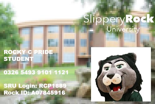
SRU students got an email over the summer that announced that all students were to get new student IDs within the first several weeks of school. Despite the IDs’ function remaining largely the same, with only the exemption of recently discontinued “Rock Dollars,” they have one glaring flaw. We at the Rocket feel that not only are our new IDs not representative of the best aspects of SRU, but are also ugly.
The old IDs featured the trademark of SRU’s campus, Old Main, with its iconic clock that graces not only the university’s own logo, but also our logo here at the Rocket. Old Main is a historic building that most students connect with one way or the other, especially because the clock sounds off every hour.
The new IDs feature Vincent Science Center (VSC), and not the renovated VSC, but its older (and significantly more ugly) ancestor. Most of us at the Rocket have never seen VSC before it was renovated, and have no connection to the image that is splayed behind our ID information.
Being that the Rocket staff is made up largely of communication majors, we all would be compliant with having the Eisenberg Classroom Building on our IDs, but the rest of the campus would most likely feel disconnected from it. Likewise with VSC, while it may resonate with some students, many would not see a good reason for the building to be representative of the university.
In front of the ugly building on our new IDs is our iconic water fountain, another symbol many students could identify and resonate with, but the logo on the front of it isn’t visible, and the fountain itself is turned off. Instead of the fountain that many students could identify front-on, it instead looks like a random pile of rubble accumulated in front of an already unattractive building.
The logo on the IDs is also pixelated, and doesn’t have a high enough contrast for the white to stand out against the background. The university’s logo should be the part that stands out most on the IDs, but it just fades into its equally low-res and pixelated background.
With SRU’s staff continually working to make the campus more attractive for potential students, one would think that they’d use the most attractive and resonating images for its student IDs, but with the new IDs this isn’t the case.
A student ID is something that students constantly use, whether they’re swiping into Boozel or the ARC, or even getting student discounts at restaurants and stores. Because it is something that is continually used by students, it should be a photo of something that resonates with all of them.
We have historic Old Main, a waterfall that nearly every freshman has taken a photo with, and a fairly new (and expensive)student center. All of these should have been considered before VSC or any other academic building that most students can’t relate to.
Instead of randomly selecting students to take a survey on what should’ve been on the ID cards, the people that issued the cards could’ve at least sent out a mass email where students could vote on several locations that would be featured.
Though many students wouldn’t care or vote either way, it’s still important to give everyone the option to vote. Because students are most likely going to carry their ID card in their wallet for about four years, it’s important that we all have a say in what’s going on them.
And what’s going on them should be a solid photo of a place that all students can recognize and be proud of, as well as one that isn’t pixelated so the IDs don’t look thrown together.


I don’t know, an (at least) six year old photo of an obsolete building with a pile of rubble in front of it pretty much sums up the SRU experience, doesn’t it?